_CODING
processing/p5.js
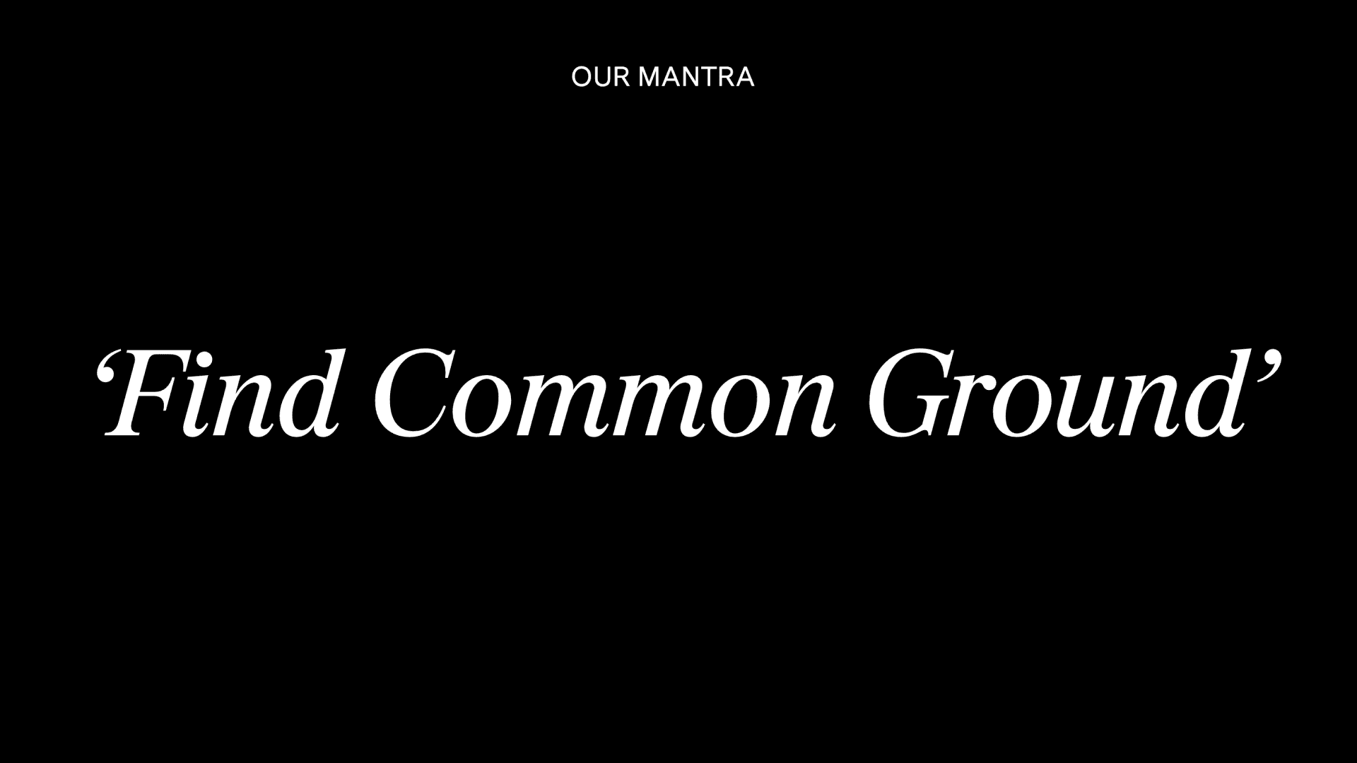
Kendall Common
Branding, Website Design
OurFriends London
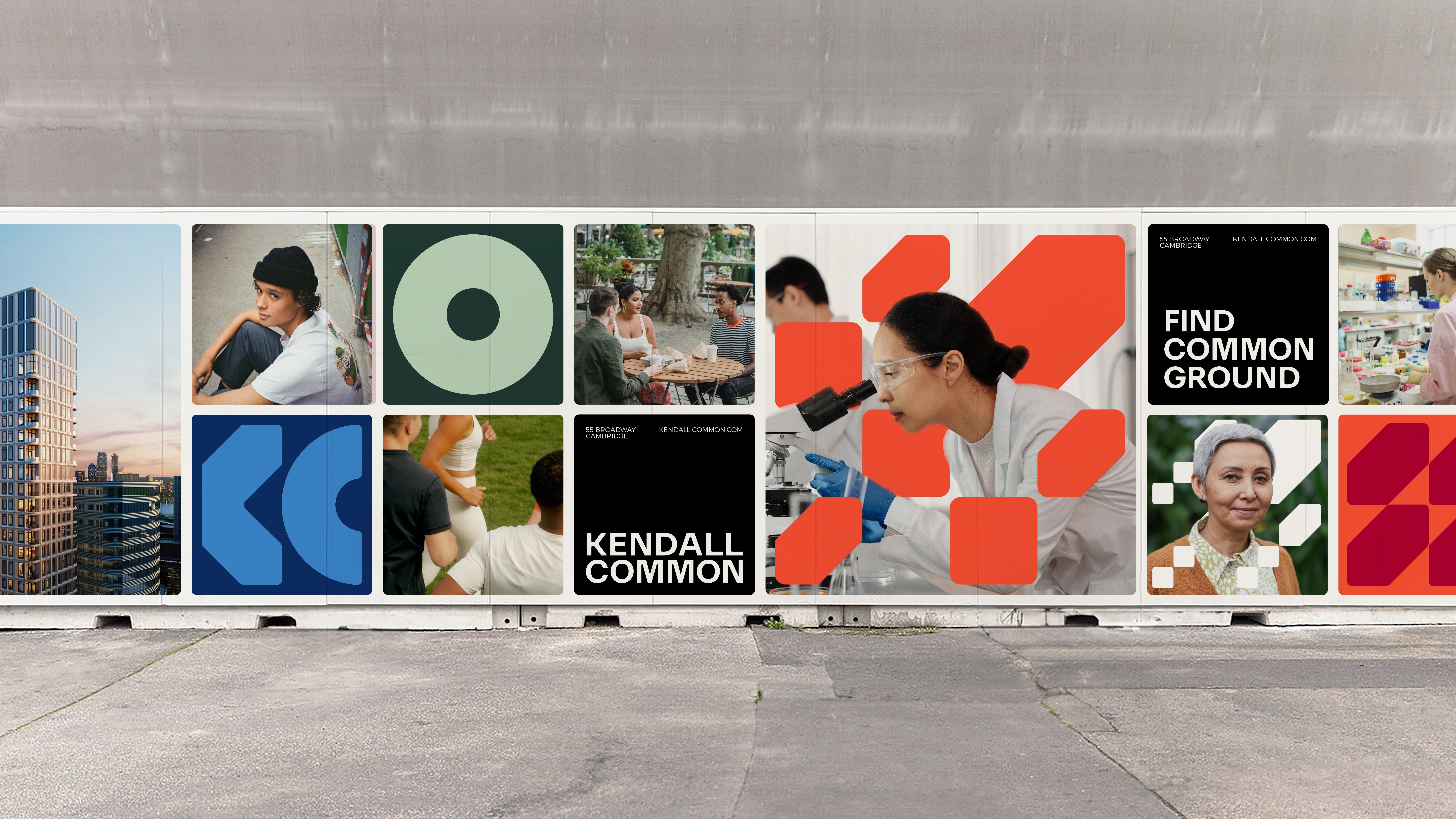
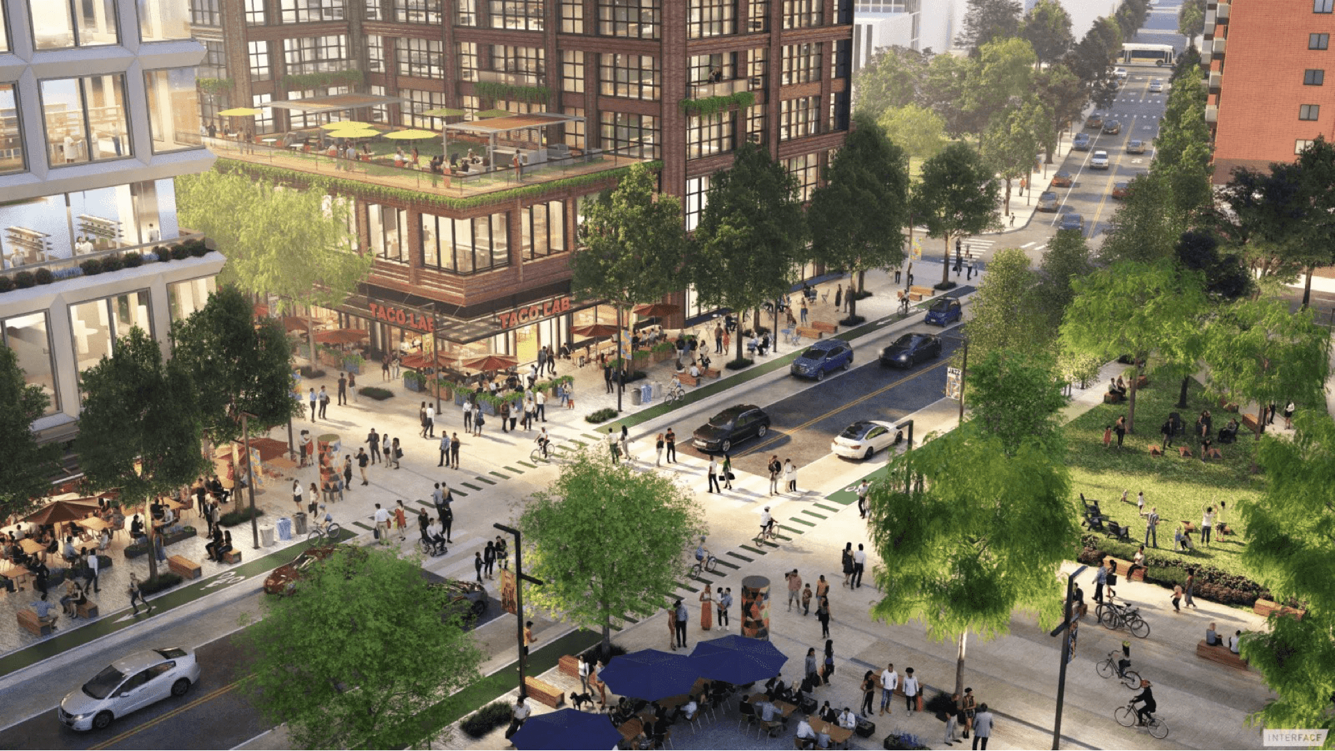
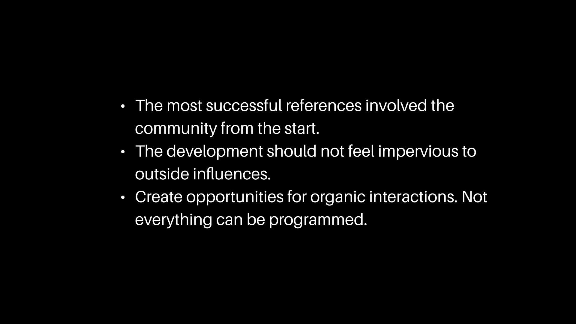
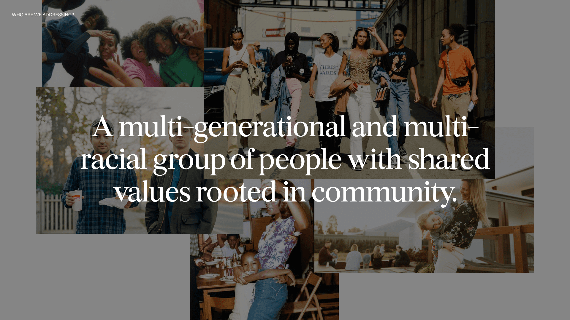
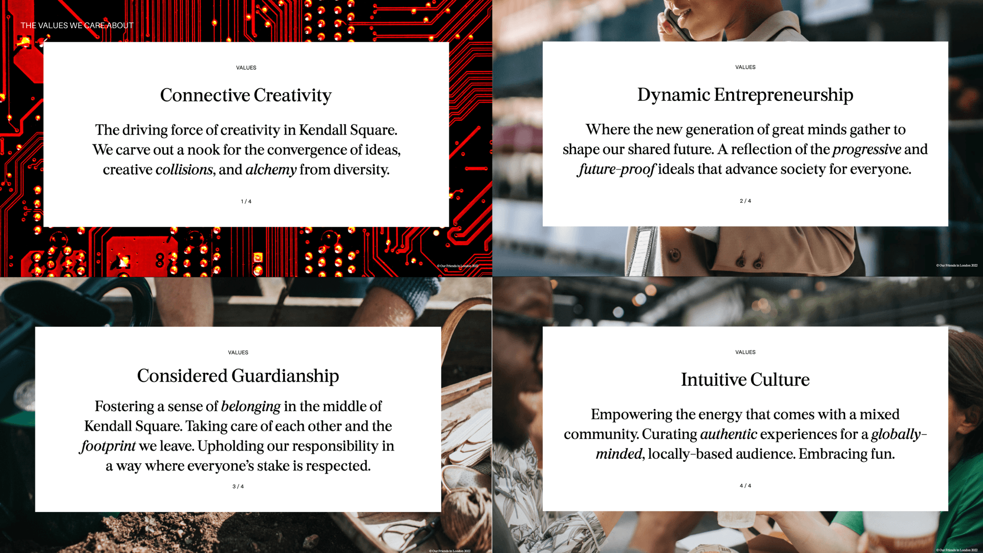
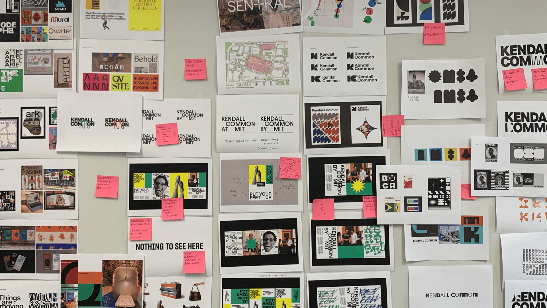
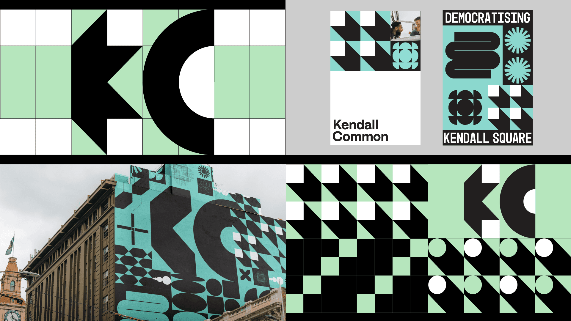
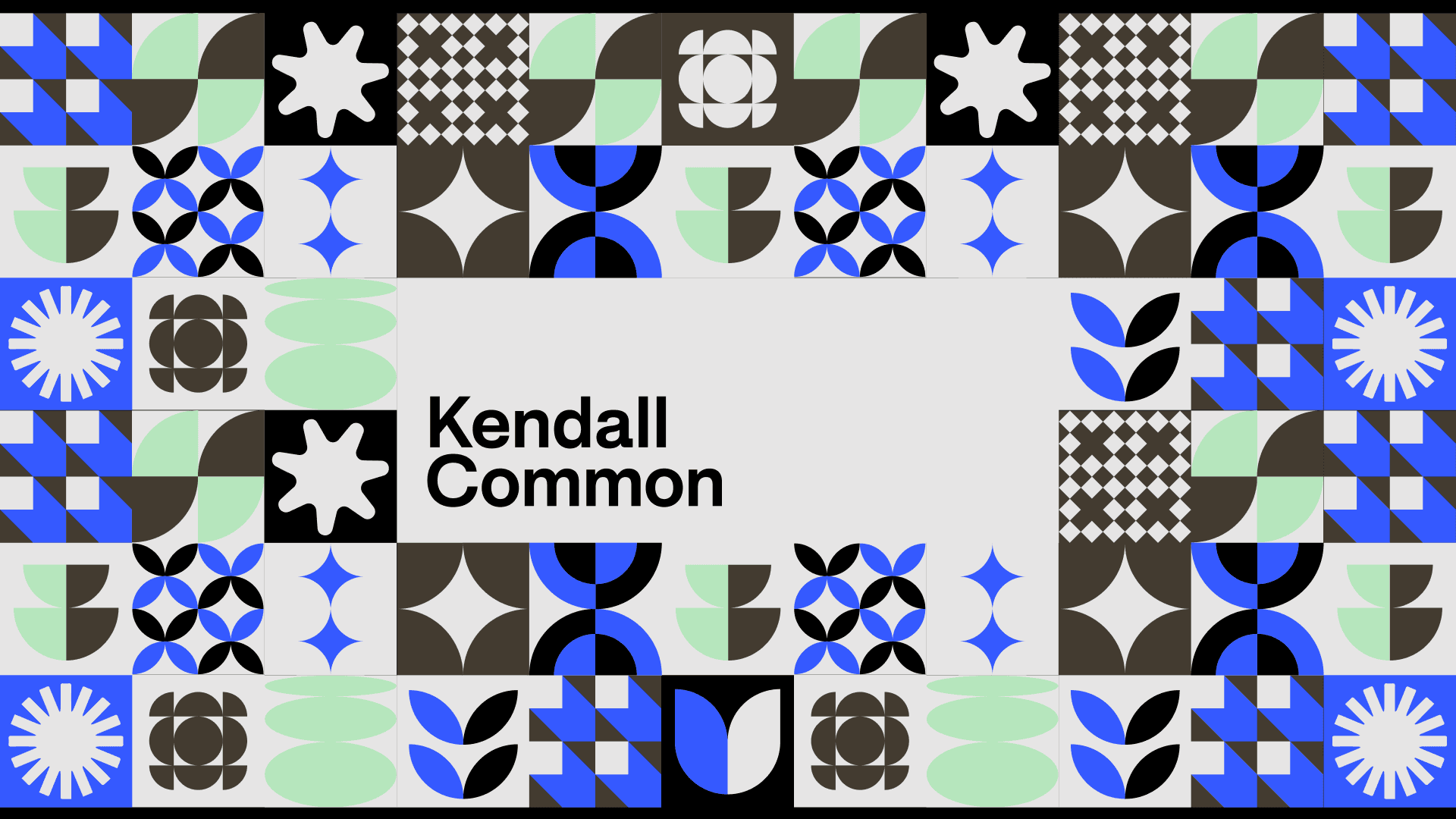
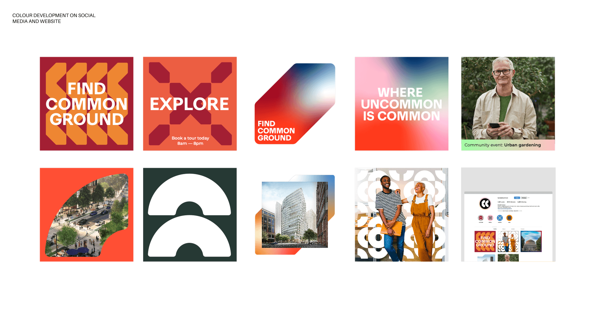
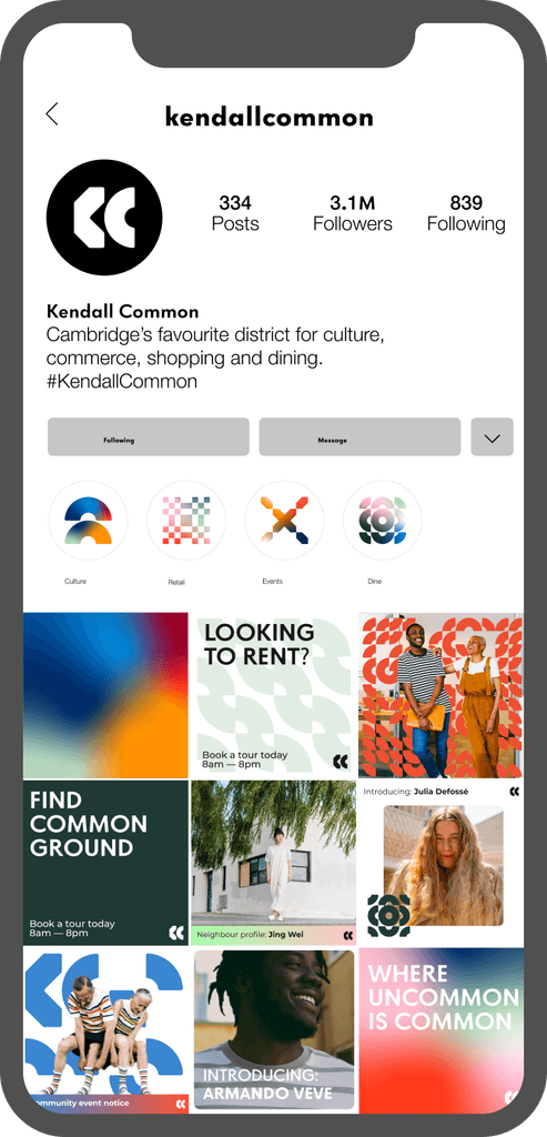
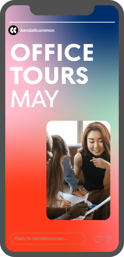
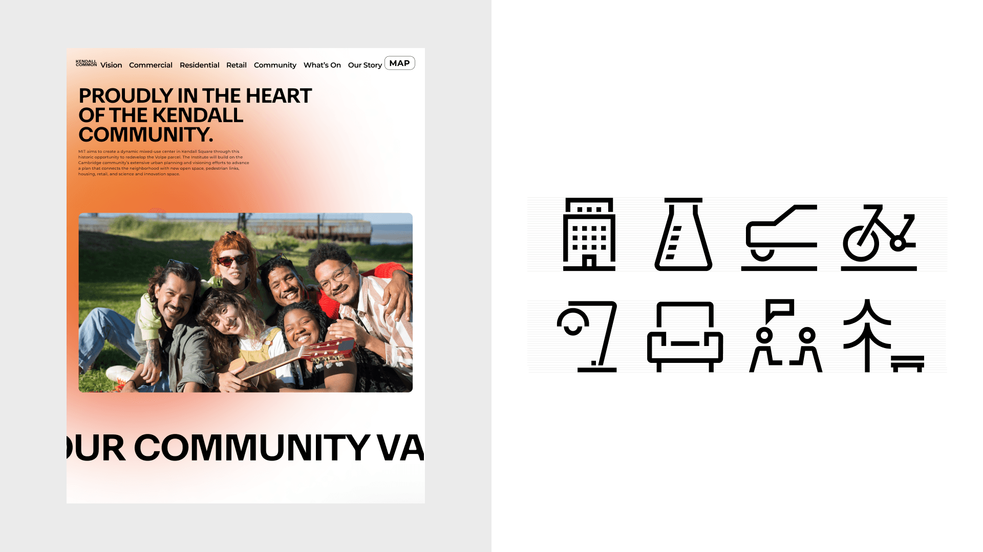
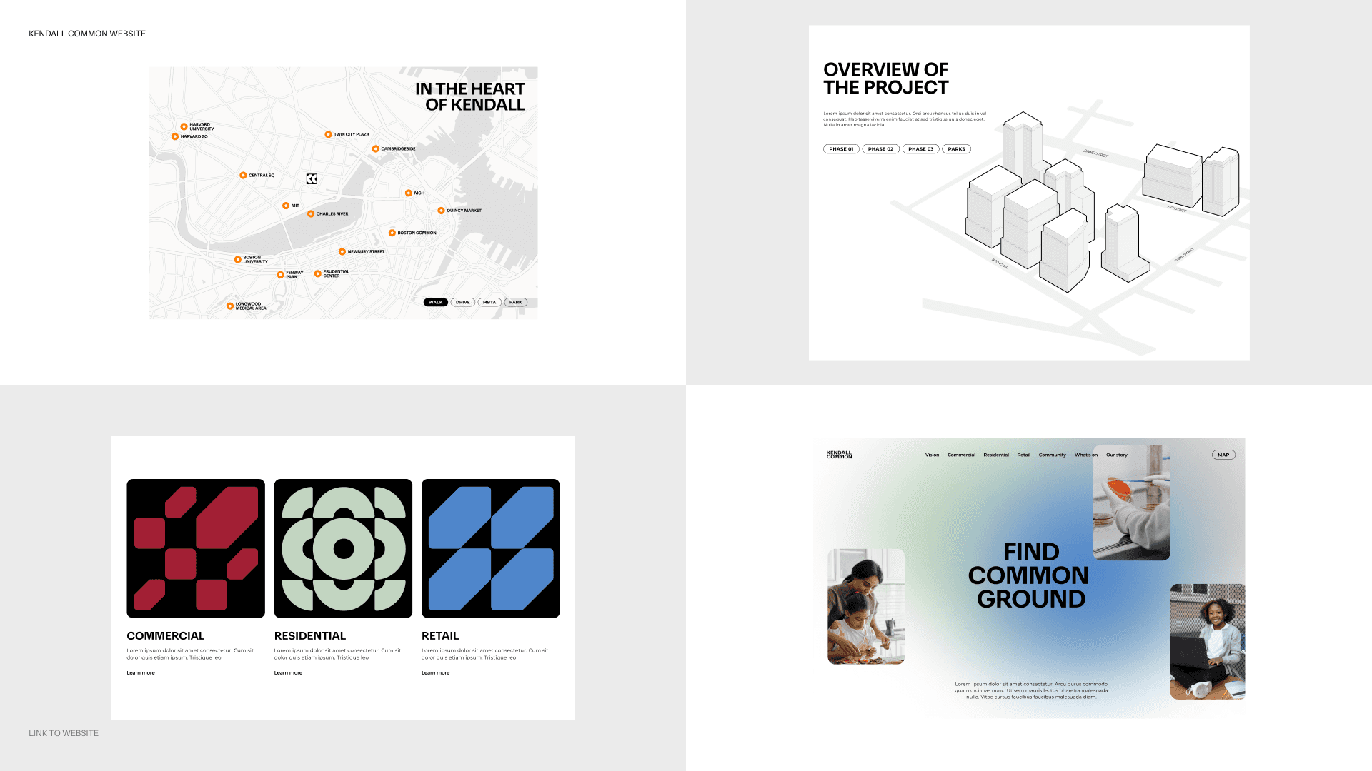
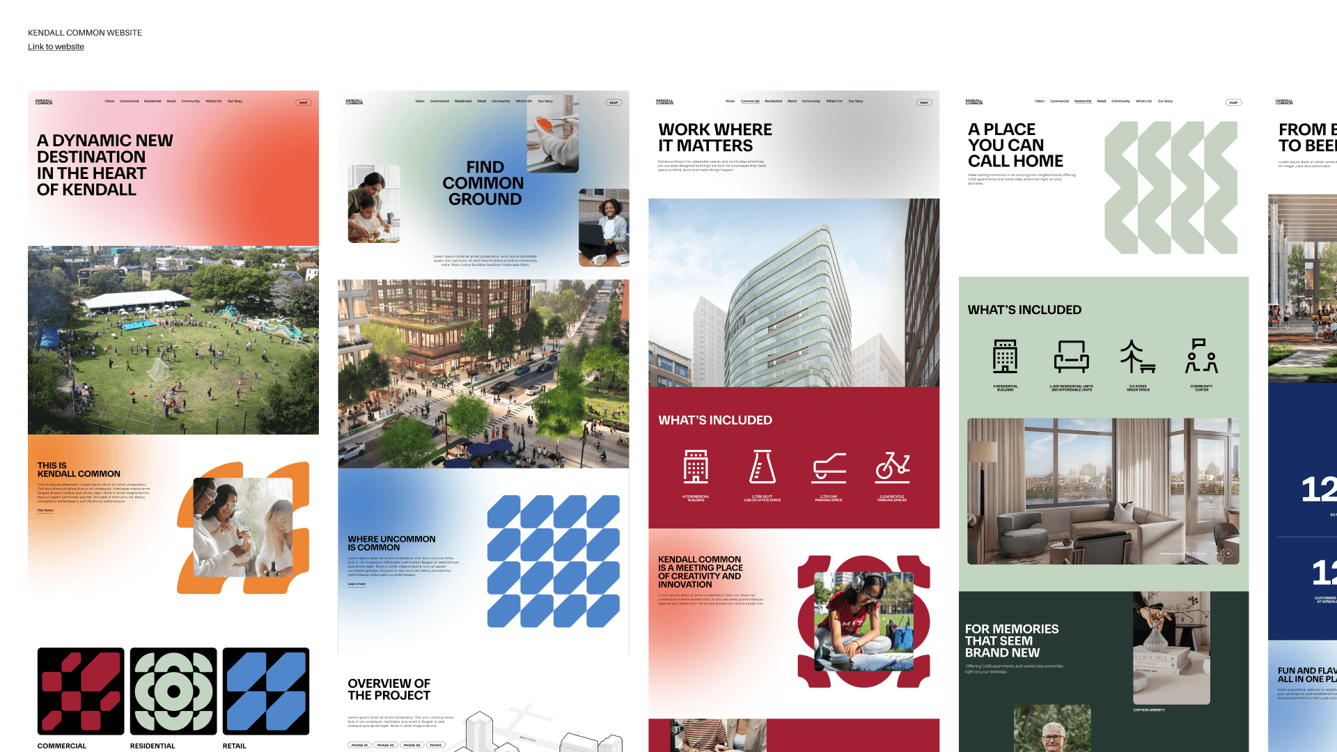
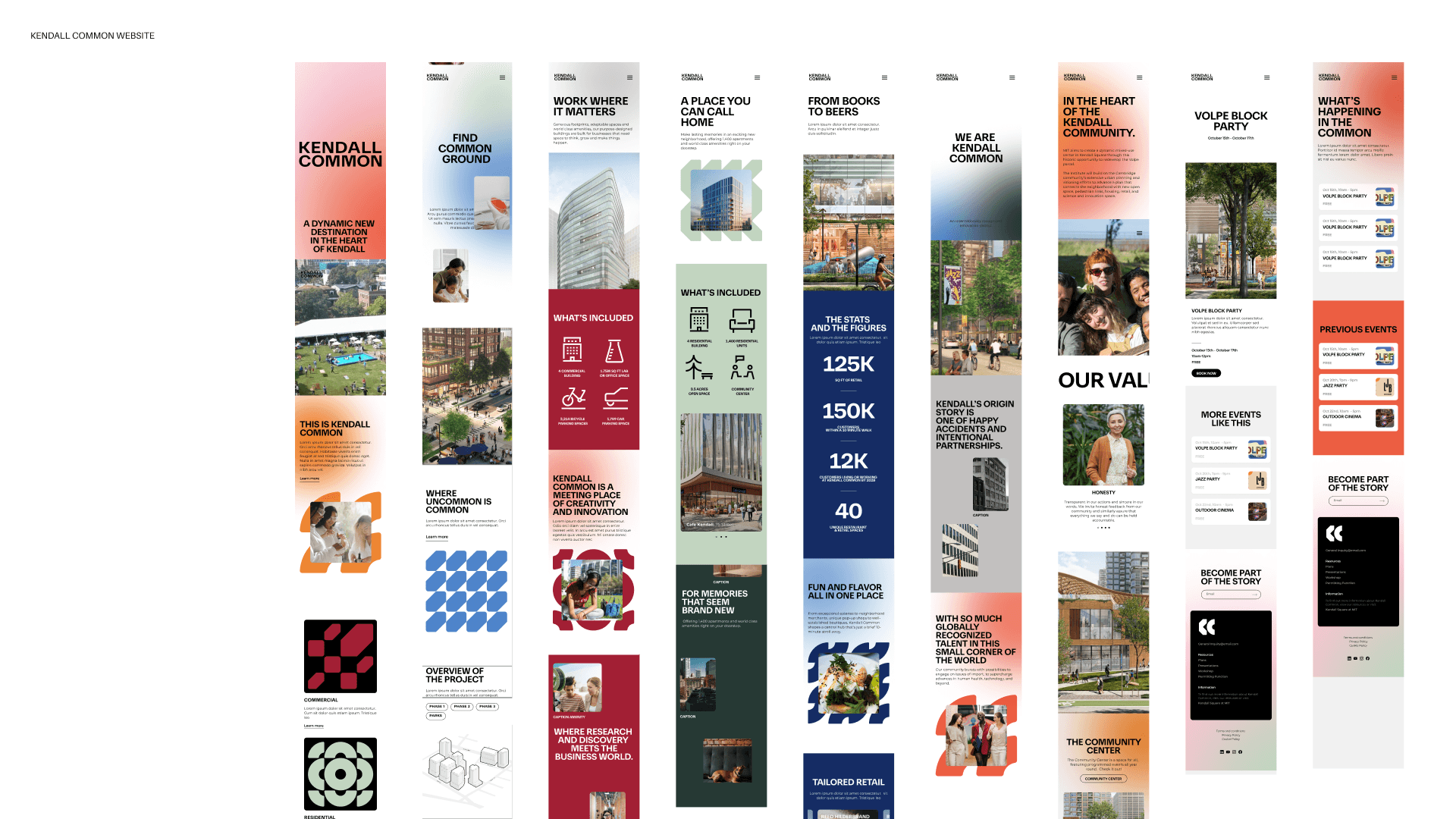
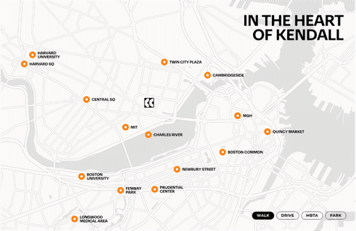
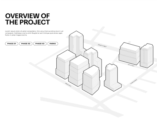
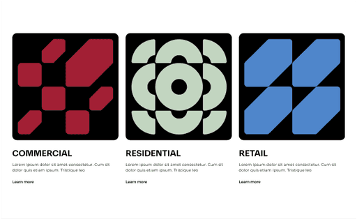
Kendall Common is a dynamic neighborhood located on a 14-acre site in Cambridge, MA. The neighborhood comprises of eight mixed-use buildings, green spaces and a community hub that will be an inclusive mixing pot that nurtures and inspires everyone who lives and works here. I worked on the branding and website for leasing purposes.

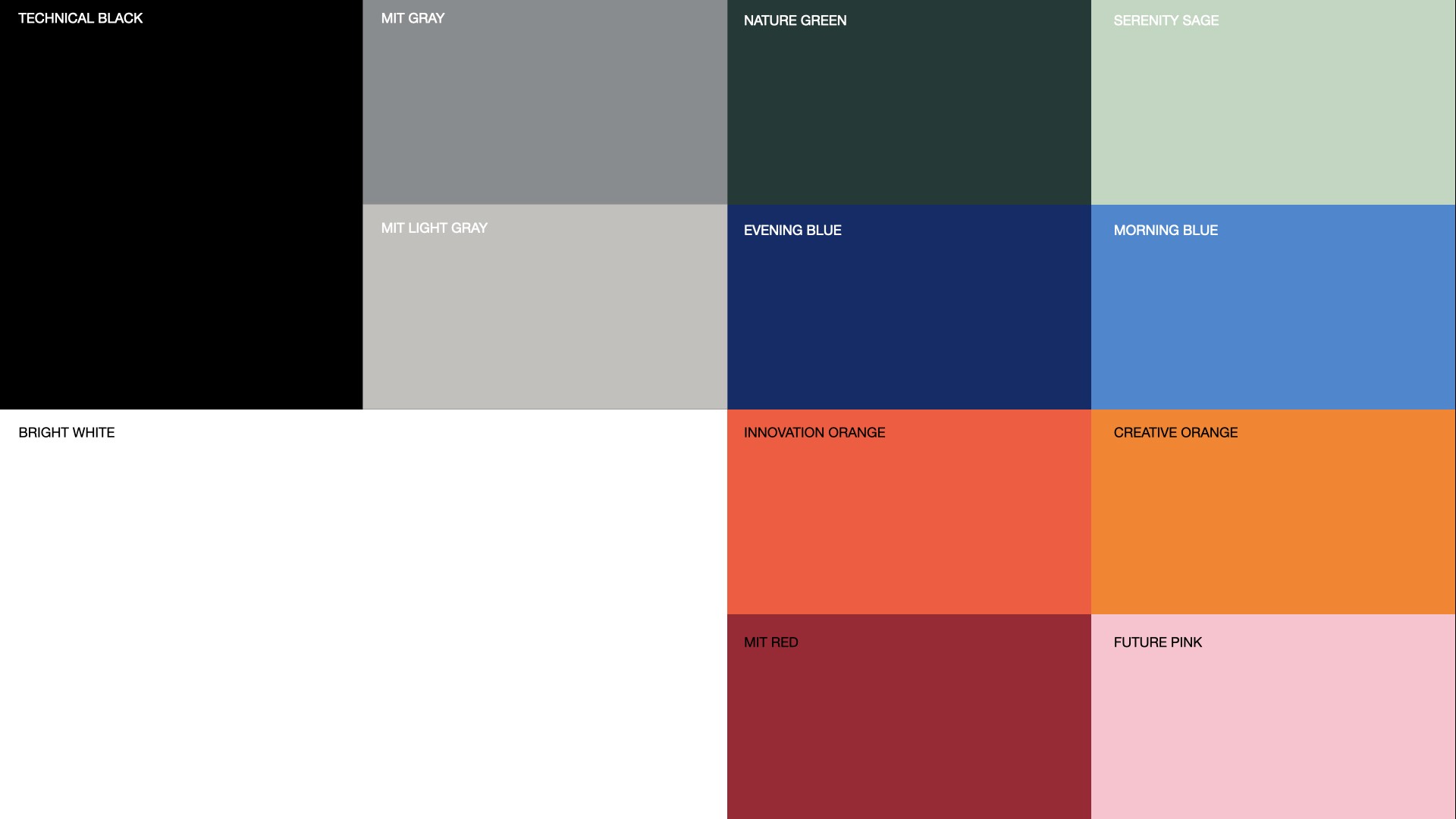
HEADLINE TYPEFACE
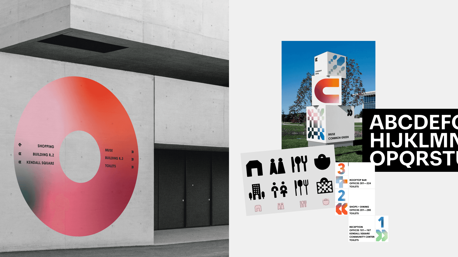
Kendall Sans is our Headline Typeface. It is a geometric san serif with circular features to have visual synergy with the KC monogram. It features rounded corners and ink traps which brings an engineered quality and quirk. Kendall Sans is a bespoke titling typeface, specially created for the Kendall Common brand.


_CODING
processing/p5.js
Kendall Common
Branding, Website Design
OurFriends London
Kendall Common is a dynamic neighborhood located on a 14-acre site in Cambridge, MA. The neighborhood comprises of eight mixed-use buildings, green spaces and a community hub that will be an inclusive mixing pot that nurtures and inspires everyone who lives and works here. I worked on the branding and website for leasing purposes.
HEADLINE TYPEFACE
Kendall Sans is our Headline Typeface. It is a geometric san serif with circular features to have visual synergy with the KC monogram. It features rounded corners and ink traps which brings an engineered quality and quirk. Kendall Sans is a bespoke titling typeface, specially created for the Kendall Common brand.
Kendall Common
Branding, Website Design
OurFriends London
Kendall Common is a dynamic neighborhood located on a 14-acre site in Cambridge, MA. The neighborhood comprises of eight mixed-use buildings, green spaces and a community hub that will be an inclusive mixing pot that nurtures and inspires everyone who lives and works here. I worked on the branding and website for leasing purposes.
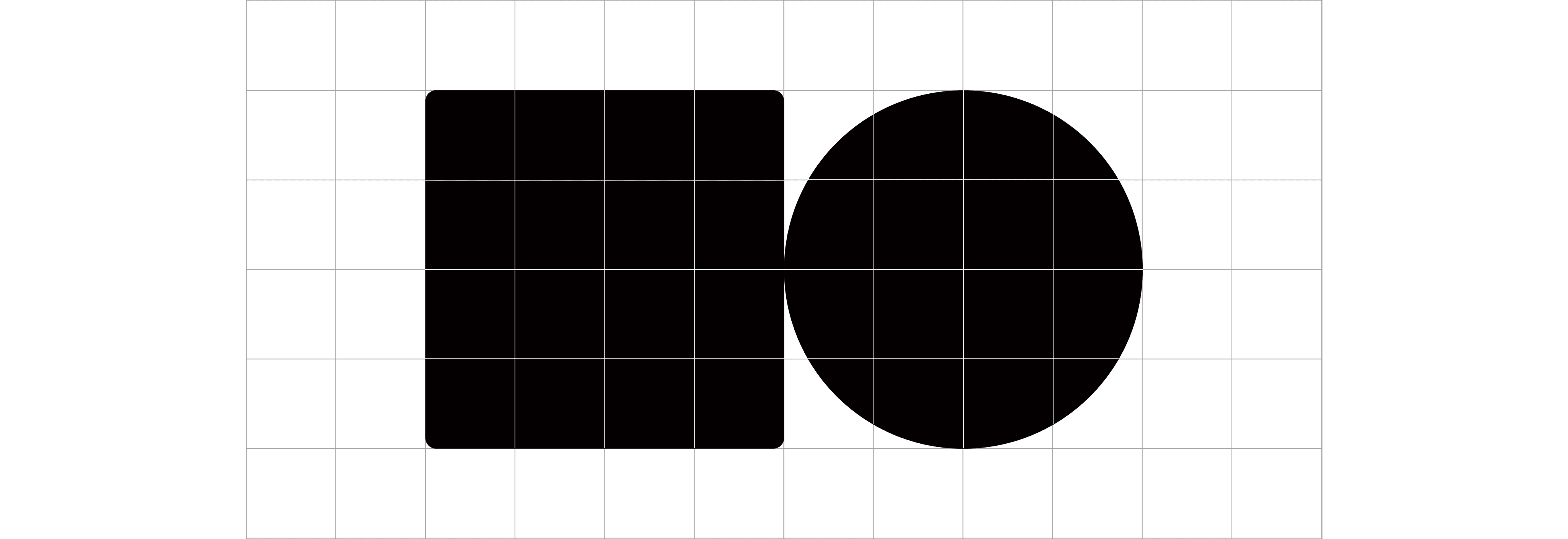
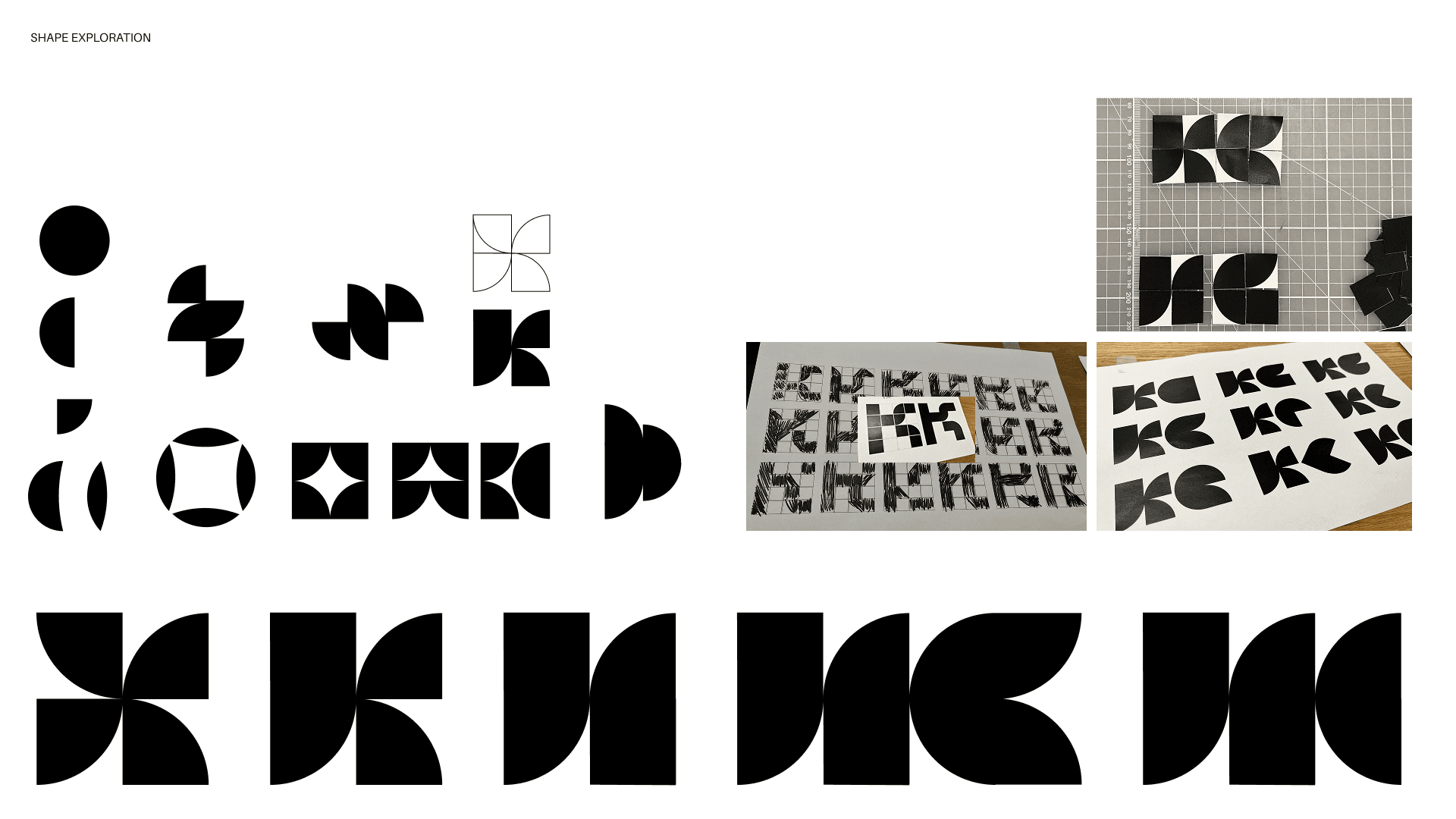
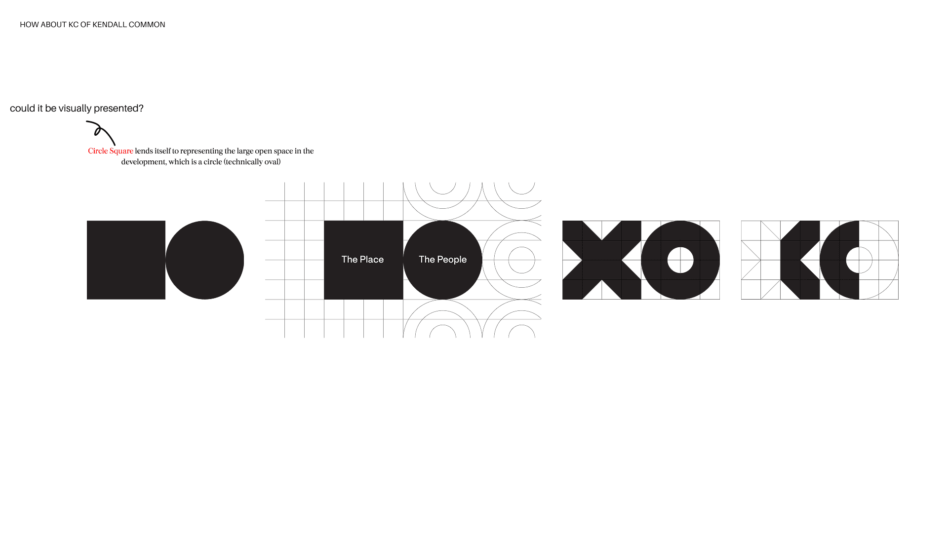
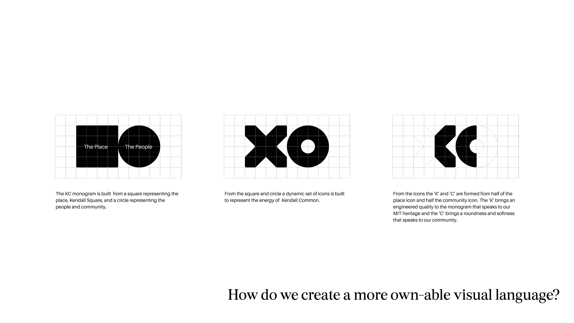
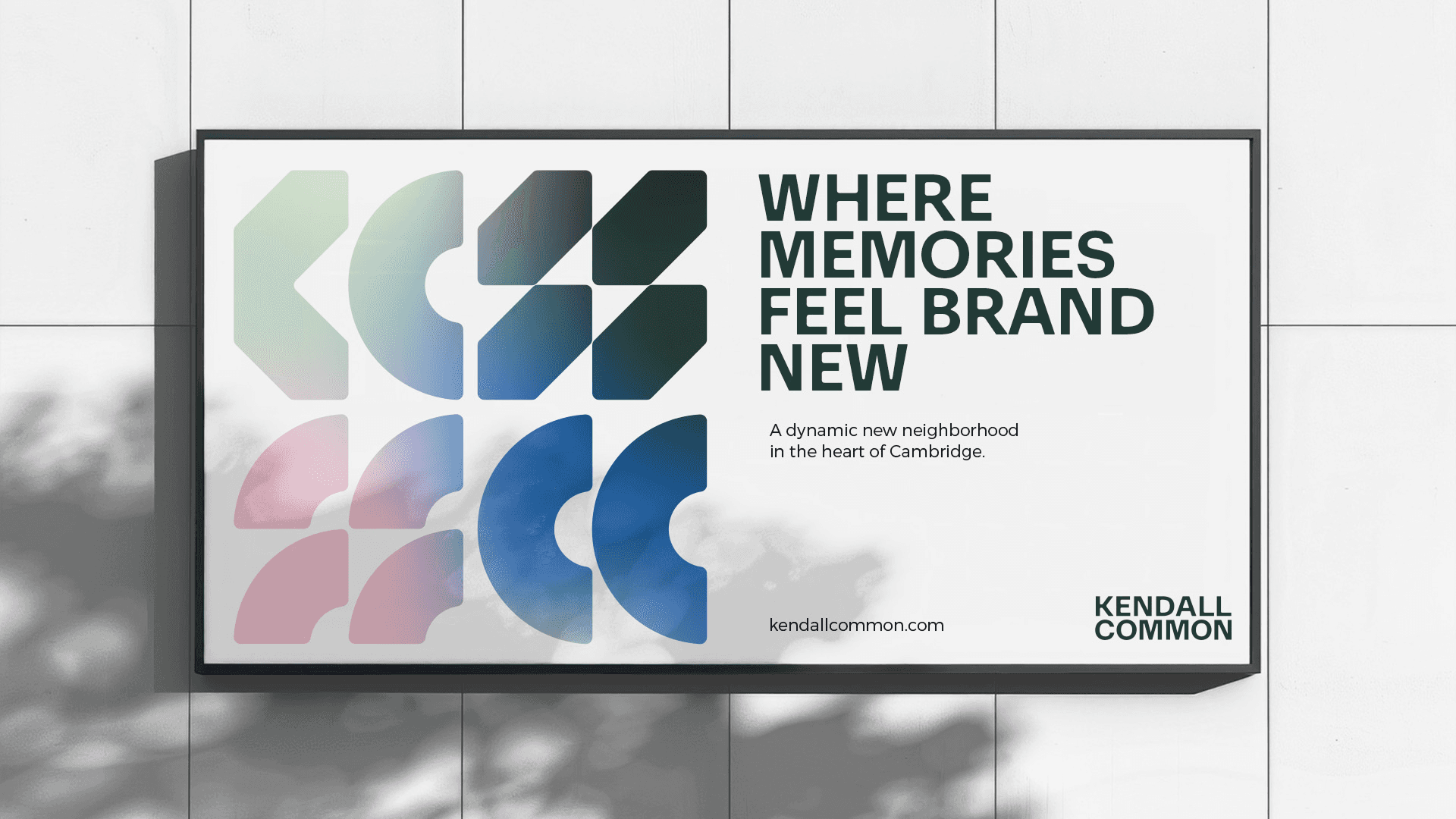
The Place
The People
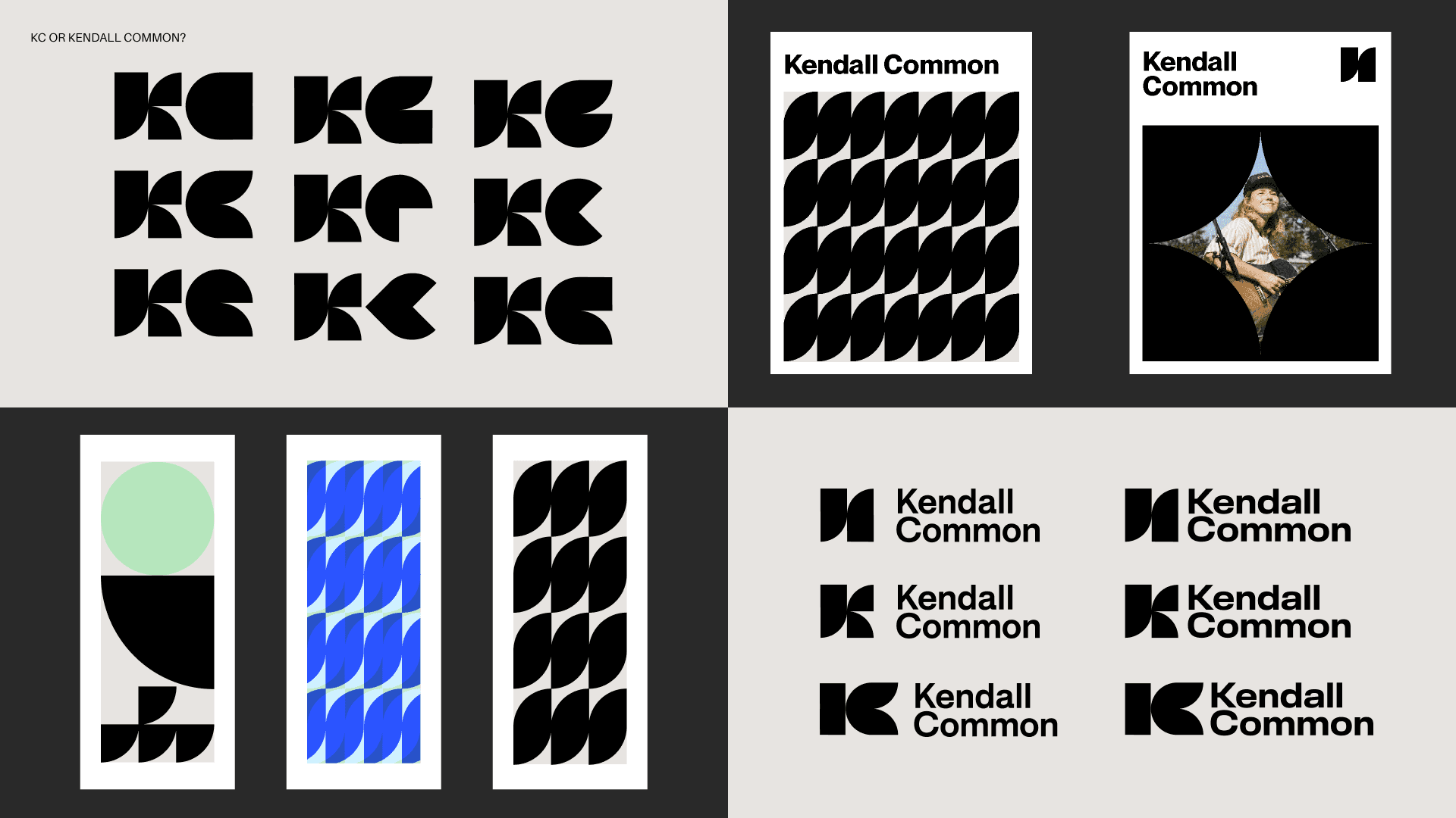
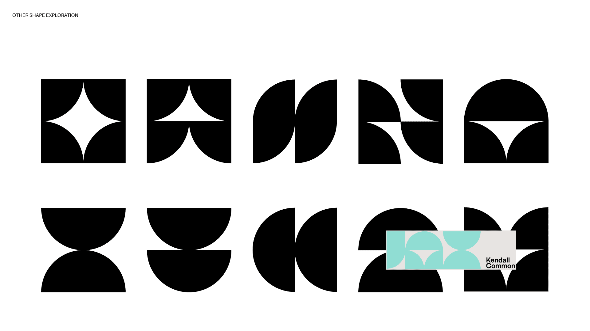
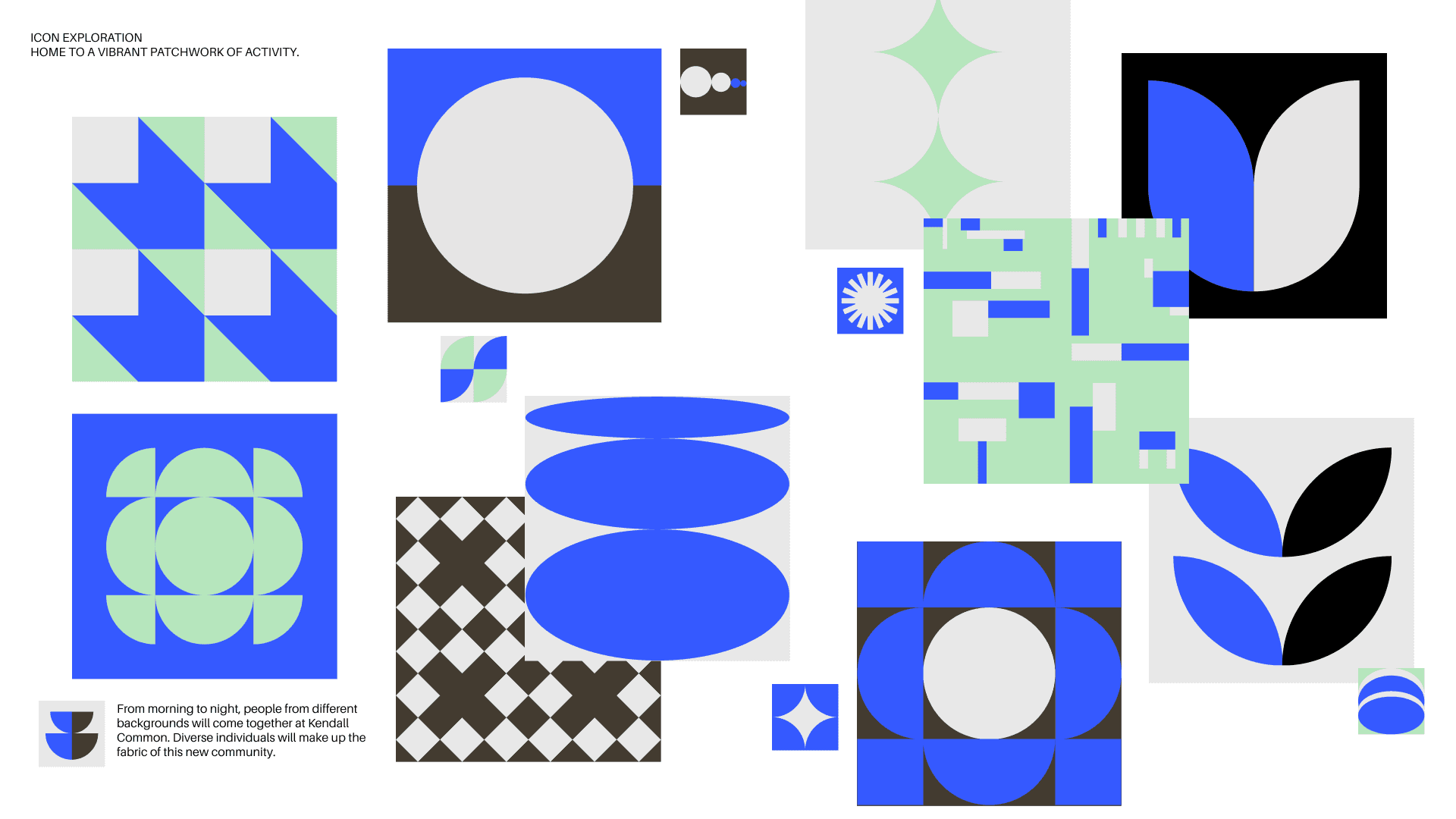
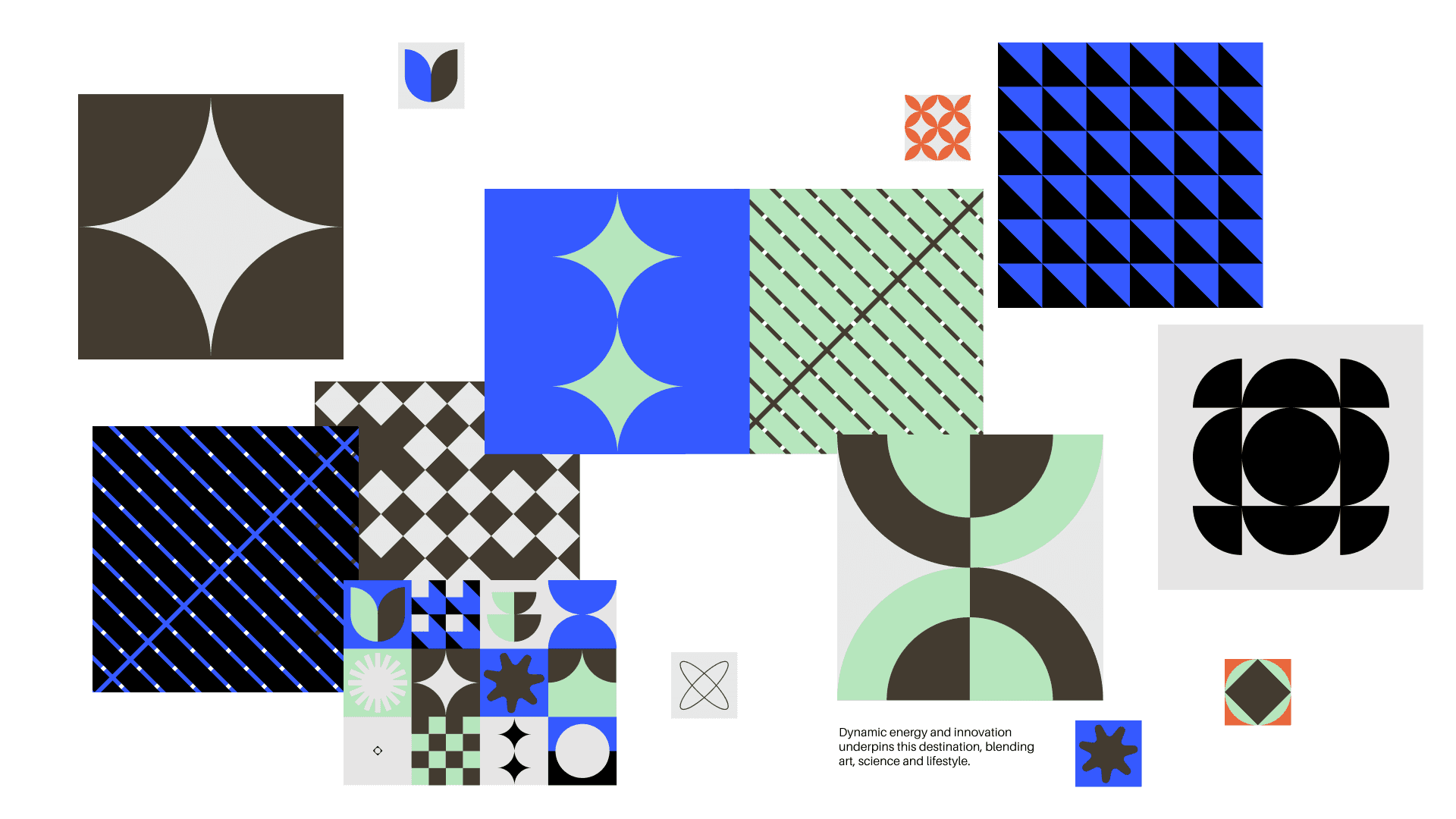
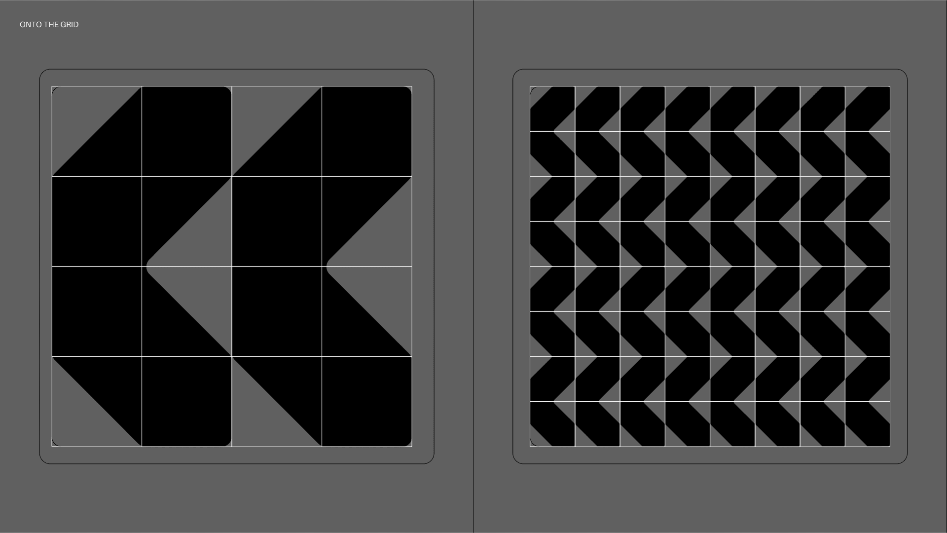
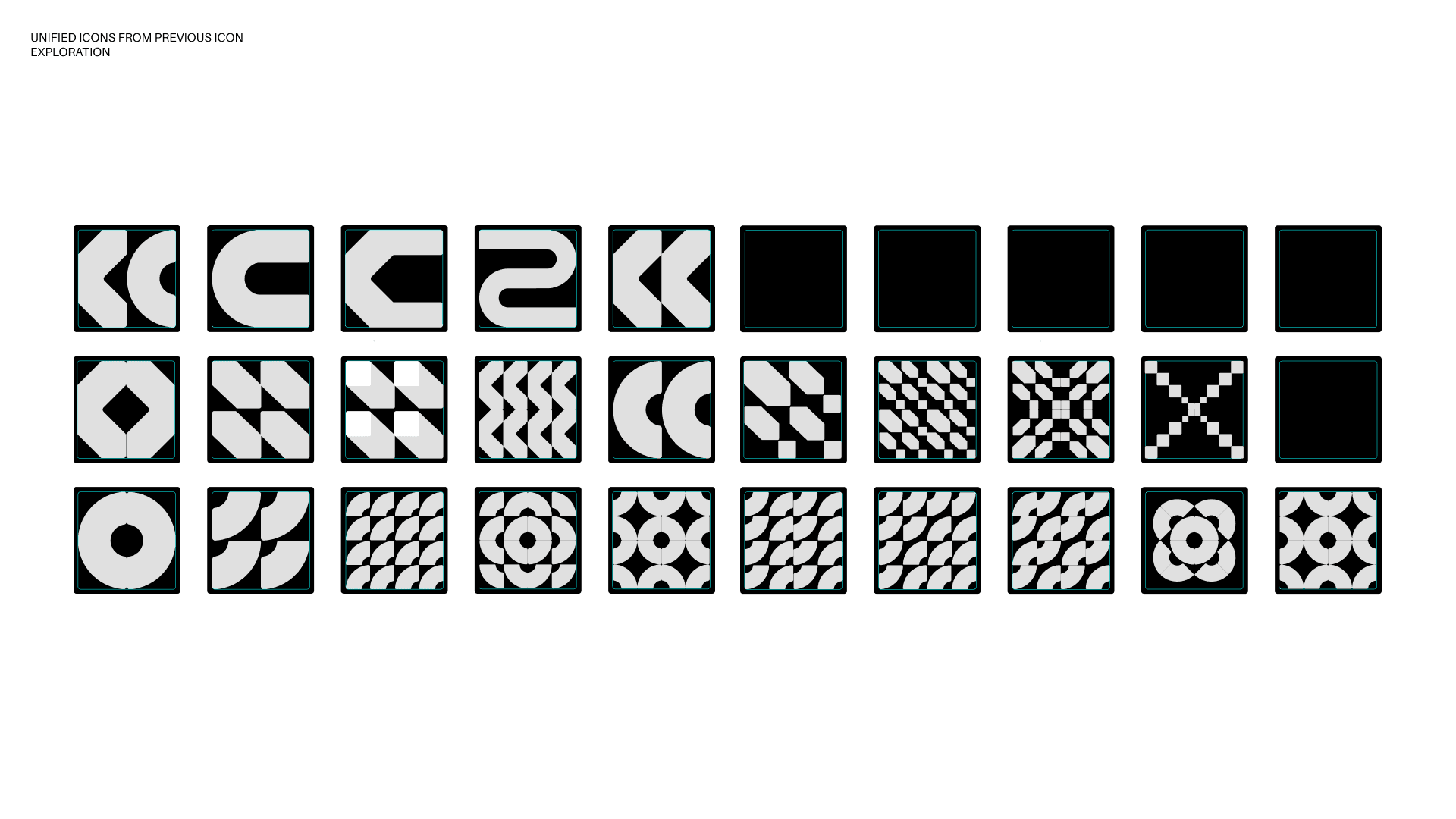
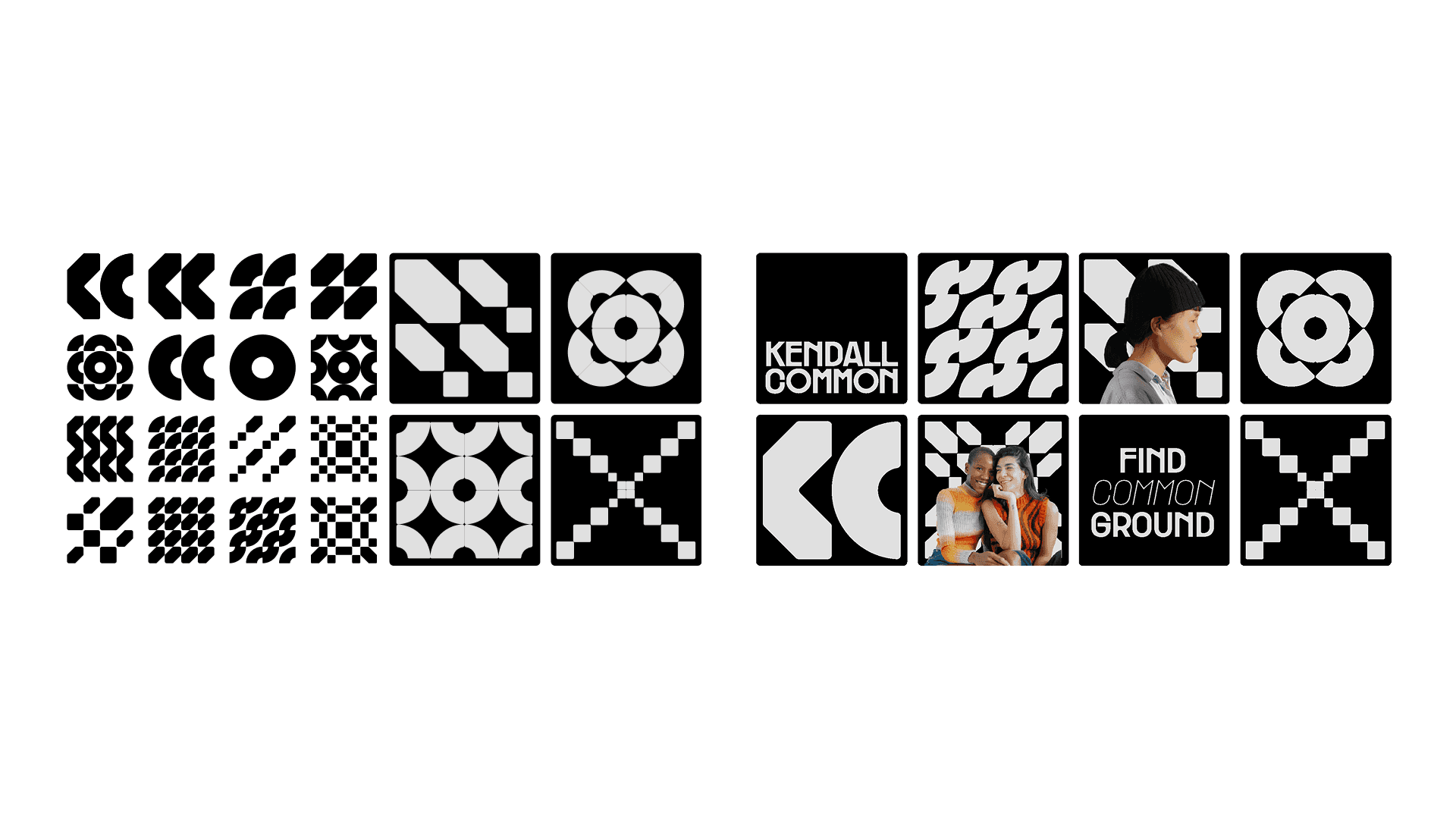
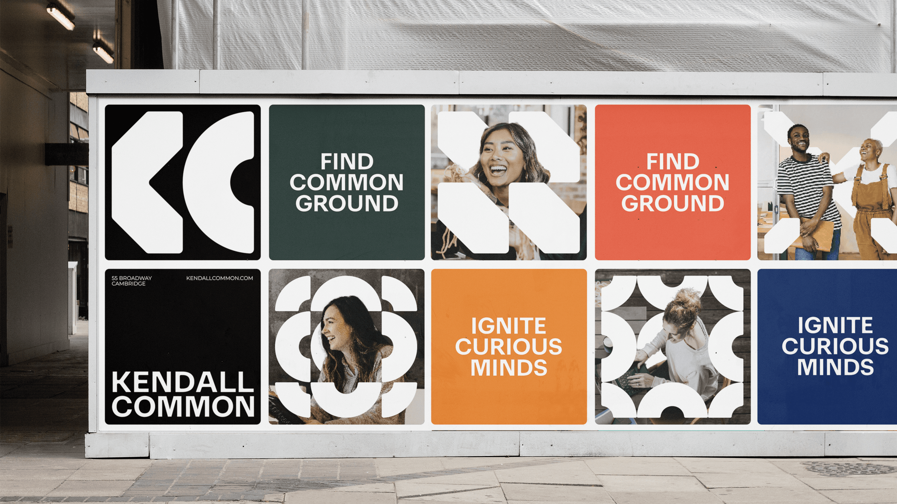
The KC monogram is built from a square representing the place, Kendall Square, and a circle representing the people and community.
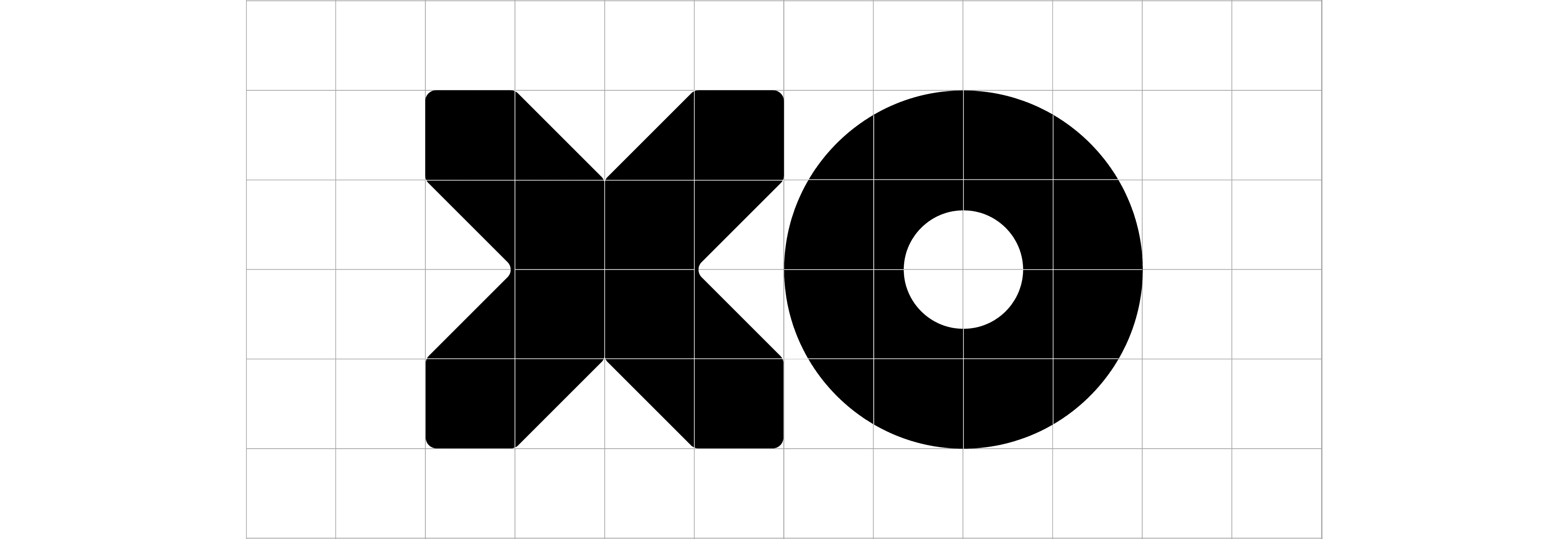
From the square and circle a dynamic set of icons is built to represent the energy of Kendall Common.
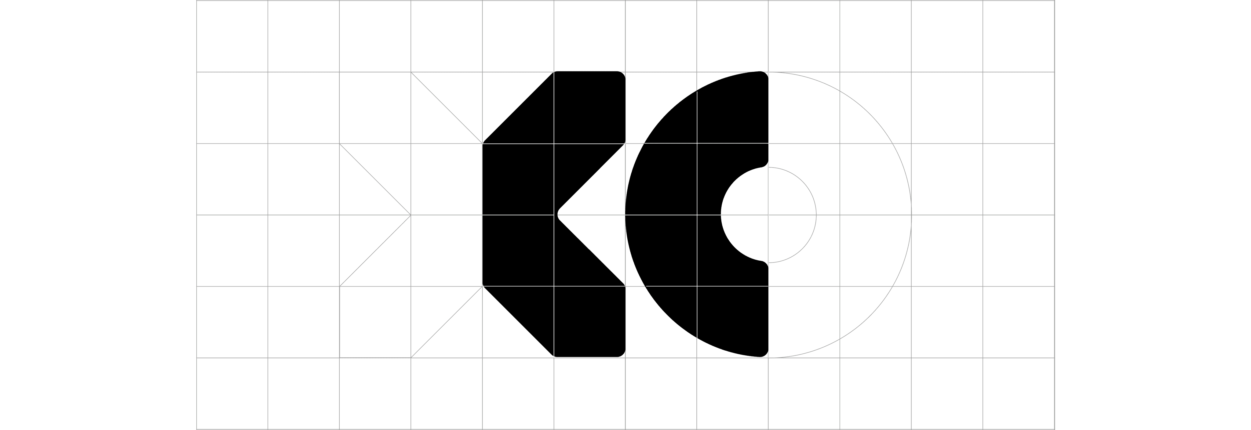
The 'K' and 'C' icons originate from parts of the emblems for location and individuals respectively. 'K' adds an industrial aspect to the symbol, echoing our MIT beginnings, whilst 'C' lends a softness and completeness, referring to our shared community.
HEADLINE TYPEFACE
Kendall Sans is our Headline Typeface. It is a geometric san serif with circular features to have visual synergy with the KC monogram. It features rounded corners and ink traps which brings an engineered quality and quirk. Kendall Sans is a bespoke titling typeface, specially created for the Kendall Common brand.


Kendall Common
Branding, Website Design
OurFriends London
Kendall Common is a dynamic neighborhood located on a 14-acre site in Cambridge, MA. The neighborhood comprises of eight mixed-use buildings, green spaces and a community hub that will be an inclusive mixing pot that nurtures and inspires everyone who lives and works here. I worked on the branding and website for leasing purposes.
The Place
The People
The KC monogram is built from a square representing the place, Kendall Square, and a circle representing the people and community.
From the square and circle a dynamic set of icons is built to represent the energy of Kendall Common.
The 'K' and 'C' icons originate from parts of the emblems for location and individuals respectively. 'K' adds an industrial aspect to the symbol, echoing our MIT beginnings, whilst 'C' lends a softness and completeness, referring to our shared community.
HEADLINE TYPEFACE
Kendall Sans is our Headline Typeface. It is a geometric san serif with circular features to have visual synergy with the KC monogram. It features rounded corners and ink traps which brings an engineered quality and quirk. Kendall Sans is a bespoke titling typeface, specially created for the Kendall Common brand.
Kendall Common
Branding
0%
Kendall Common
Branding
0%
Kendall Common
Branding
0%
Kendall Common
Branding
0%